-
Ads
- location_on
Outdoor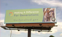
- panorama
Billboard - digital_out_of_home
Digital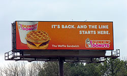
- transportation
Transit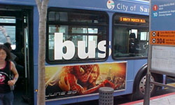
- directions_bus
Bus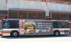
- transfer_within_a_station
Bus Stop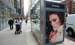
- road
Street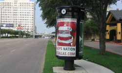
- weekend
Bench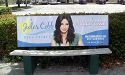
- storefront
Mall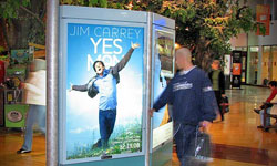
- local_airport
Airport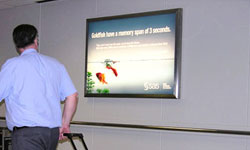
- local_taxi
Taxi/Uber
- local_gas_station
Gas Stn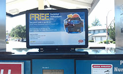
- local_grocery_store
Grocery
- local_convenience_store
C-Store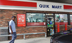
- local_cafe
Coffee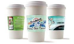
- local_pizza
Pizza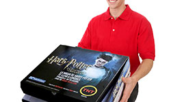
- local_bar
Bar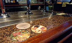
- attach_money
Cash
- subway
Subway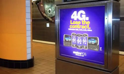
- train
Train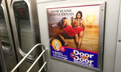
- flight
Aerial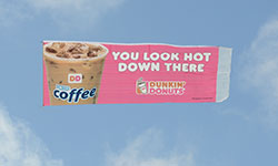
- wc
Restroom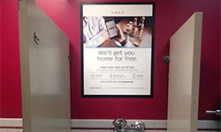
- local_shipping
Mobile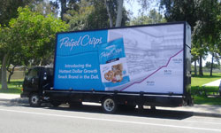
- electric_rickshaw
Pedicab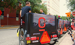
- movie
Movie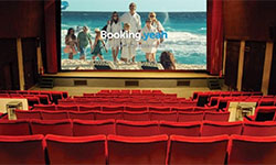
- meeting_room
Door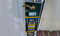
- local_laundry_service
Laundromat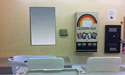
- elderly
Senior
- fitness_center
Gym
- content_cut
Hair/Nail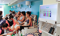
- school
College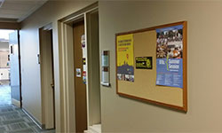
- diversity_3
Hispanic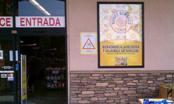
- cooking
Food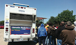
- local_hospital
Medical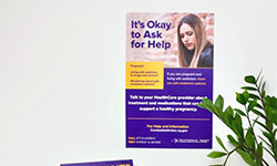
- place
Place-Based - elevator
Elevator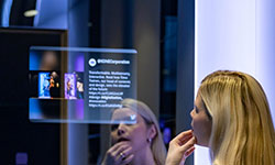
- ballot
Political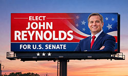
- stadium
Stadium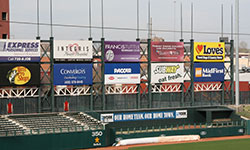
- event
Event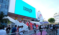
- groups
Convention - nature
Wild
- radio
Radio
- location_on
- See
- Contact
- Pricing
- location_on
Outdoor - panorama
Billboard - digital_out_of_home
Digital - transportation
Transit - directions_bus
Bus - transfer_within_a_station
Bus Stop - road
Street - weekend
Bench - storefront
Mall - local_airport
Airport - local_taxi
Taxi/Uber - local_gas_station
Gas Stn - local_grocery_store
Grocery - local_convenience_store
C-Store - local_cafe
Coffee - local_pizza
Pizza - local_bar
Bar - attach_money
Cash - subway
Subway - train
Train - flight
Aerial - wc
Restroom - local_shipping
Mobile - electric_rickshaw
Pedicab - movie
Movie - meeting_room
Door - local_laundry_service
Laundromat - elderly
Senior - fitness_center
Gym - content_cut
Hair/Nail - school
College - diversity_3
Hispanic - cooking
Food - local_hospital
Medical - place
Place-Based - elevator
Elevator - ballot
Political - stadium
Stadium - event
Event - groups
Convention - nature
Wild - radio
Radio - campaign
Campaigns - record_voice_over
Testimonials - diversity_3
Clients - quiz
FAQ - emoji_events
Benefits - menu_book
Studies - description
Specs - lightbulb
Tips - request_quote
Static vs. Digital - ads_click
Digital Works - view_in_ar
Billboard Preview - design_services
Design - upload
Upload
Outdoor Advertising Design Tips & Best Practices
Also check out these PDFs on effective design:
Graphic Design Included FREE
Free graphic design is included in purchase of advertising.
No fees • Fast turnarounds • Multiple revisions
Some video/animation requests may incur fees.
Overview
-
1. Have an Objective
- Name Recognition.
- Product or Service Promotion.
- Special Announcement.
- Directional.
-
2. Start With a Good Idea
Good ideas are what makes outdoor advertising so impactful. Make careful considerations to the message and the images you choose.
-
3. Production Identification
Make sure you are able to read the advertiser's name.
-
4. Short Copy and Be Concise
Read time is 4 to 5 seconds. Don’t use more than 7 words and keep them short for easy comprehension.
-
5. Push Readability - Large and Legibile Type
Simple fonts. Big text. Contrasting colors. Lettering should be a minimum of one foot tall. Remember these are viewed from 400 - 600 feet.
-
6. Increase Line Thickness
At 600 feet, thin lines disappear.
-
7. Forget the "White Space Rule"
It doesn’t apply to outdoor like it does with print advertising.
-
8. Bold Colors
Be bold with colors. Being subtle at 600 feet doesn’t work.
-
9. High Contrast
For high visibility, use contrasting colors.
-
10. Simplify Everything
Stay with one key idea or objective.
-
11. View From a Distance
Look at the design from 15 feet away for only five seconds. Can you understand it? This stimulates driving past a billboard.

Digital Displays
-
1. Make the Text Large
Outdoor designs should be simple, clear and easy to read. Digital billboards should be legible from 500 feet away. Readable text should be at least 15’’ in height.
-
2. Use Bold, Non-Serif Fonts
Always use large, legible typefaces. At 500 feet, thin lines optically fade or break up. Avoid decorative, italic, or serif fonts. As a general rule, upper and lower case sans serif fonts provide the best readability. When designing for digital outdoor, we highly recommend adding a thin dark stroke around the text to separate it from the background.
Use readable fonts. Choose fonts that will be easily read at various distances. Fonts that are extremely thick, thin, or ornate can be difficult to read. Upper and lower case work better also.
-
3. Stick to One Message or Idea
Simplify everything. The key to effective outdoor is brevity. Because our audience is mobile, you have to decide what’s most important and put that on your board. Don’t present a complex message or numerous images. Have one thing that you want your audience to do or to recognize. The best outdoor media reduces a complex message to it’s essential elements.
-
4. Be Short and Sweet
Use no more than ten words total on the entire billboard – and that includes the logo/product tagline. We recommend seven words or less for the headline. Keep the words short for faster comprehension.
-
5. Contrasting Colors
Use contrasting colors. The stronger the contrast between background color and the copy, the easier it is to read at a distance. Remember, strong contrast equals better readability.
Use only RGB color for digital displays. Design as you would for a website, TV or computer monitor.
-
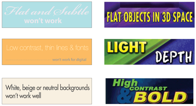
6. Avoid White Backgrounds
To achieve white, a combination of all three colors must be turned on to their maximum brightness. Consequently, white backgrounds will wash out and compete with the remainder of your creative.
In LED technology, white is a mixture of color rather than an absence of color and it has a tendency to look subdued. LED white doesn’t carry the same pop or vibrance that other colors do.
-
7. Use Bright, Bold Colors
Stick with fully saturated web-safe hues. Complimentary colors, such as red and green, are not legible together because they have similar value. Contrasting color combinations work best for viewing outdoor designs at far distances.
Rich, bold background colors work better during the day, while pastel colors are more vibrant at night.
-
8. Design With High Contrast
Being subtle does not work at great distances. Strong contrast in both hue and value are essential for creating good digital out-of-home.
-
9. Pick Your Image Wisely
Take a small object and make it large (like a watch) rather than a large object small (like a building). Avoid using landscapes or complex scenes. We recommend three visual elements or less, total. For example: one image, one logo and one headline. Busy photos typically do not translate well.
-
10. Forget About White Space
White space does not apply in Outdoor like in printed material. Increase your logo, font sizes and imagery! Having unused visual space at 300 - 500 feet is not recommended.
-
11. Test Your Idea
A billboard is not a print ad, the average viewing time is only about 5 seconds. A good test is to show the design to someone from a distance for only 5 seconds and then ask them about it. Did they understand it? Who was the advertiser? What do they think the advertiser wants them to do?
-
12. Digital Production Requirements
Digital files are normally under 1MB and easy to send by email. We require uncompressed JPEG files (RGB color mode) 1400px W x 400px H for bulletins and 840px W x 400px H for 30 sheet posters.
-
13. Change Creative Out Regularly
With no production charges and no installation schedule, digital advertising gives you freedom like never before. Change your message weekly, daily, or even hourly. Design a creative strategy to keep viewers coming back for more..
Color Tips
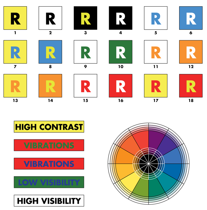
Reproduced below are 18 color combinations tested for visibility at various distances by the OAAA. Visibility is ranked in the sequence shown, with 1 the most visible and 18 the least visible.
The color wheel and colored bars, also below, illustrate the need for designers to choose colors for outdoor that are complementary and have a high contrast as well as value. For example, green and red are opposite each other and are therefore complementary colors. They represent a good contrast in hues, but in values they are very similar. The result sets up an annoying vibration. The same is true of blue and orange. Look at the design from 15 feet away for only 5 seconds. Can you understand it? This simulates driving past a billboard.
Get Pricing
Free $ For Nonprofits
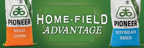
Campaigns
-
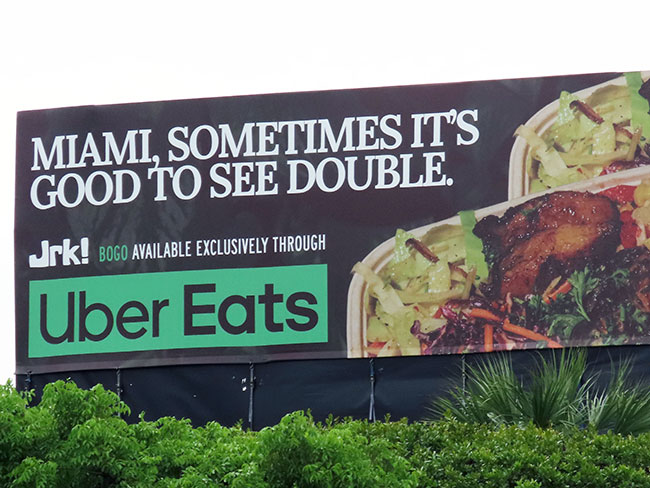
Uber Eats Advertises Partner Restaurants on Billboards.
See the ads. >> -
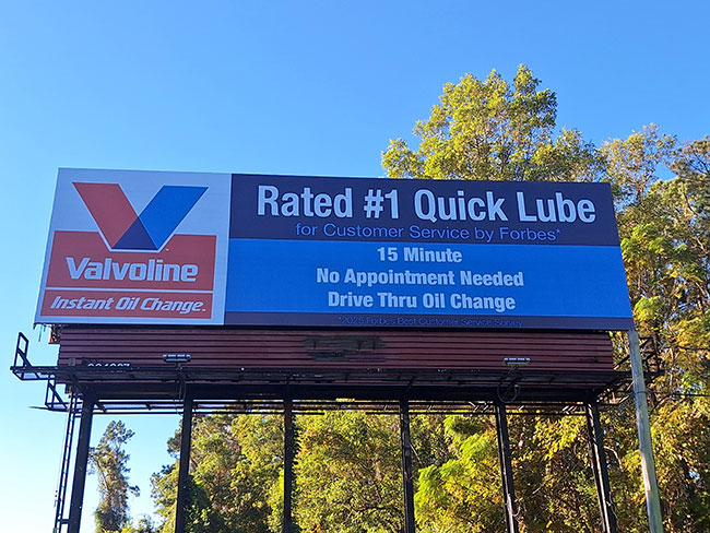
Valvoline Advertises on Out of Home Displays — Roadside Billboards, Supermarket Shopping Carts and Residential Door Hangers — to Support Oil Change Shops.
See the ads. >> -
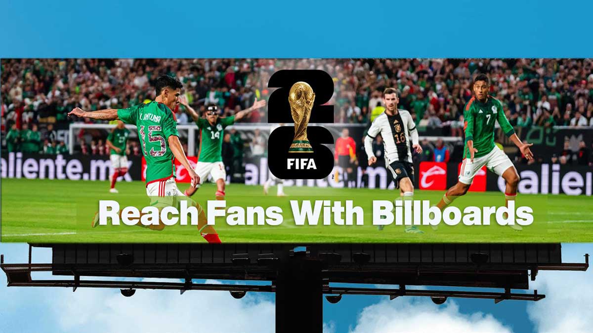
Advertise to FIFA World Cup Fans With Out of Home / Outdoor Ads, Including Billboards.
See the options. >> -

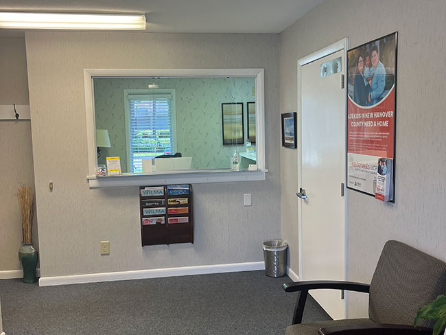
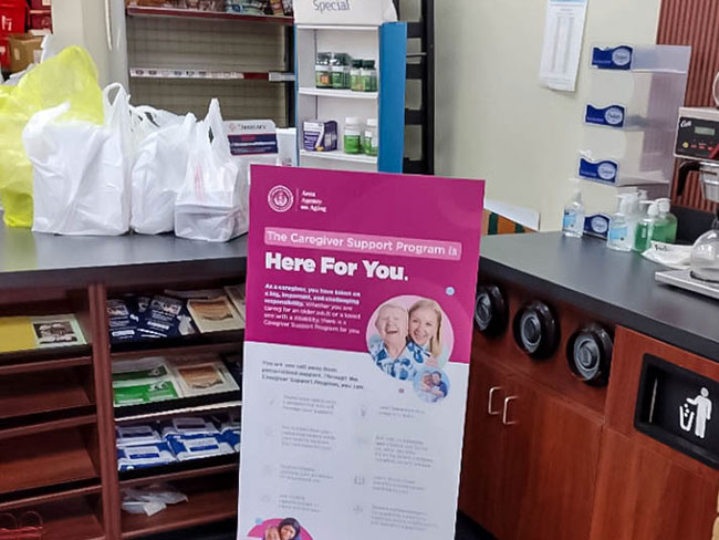
Health Insurance Company's Open Enrollment Place-Based Ads in Medical Doctors/Physicians Offices, Grocery/Convenience Stores, Laundromats, Pharmacies and Churches.
See the ads. >> -

Ohio's Get Out the Vote Campaign Advertises on Gas Station Pump Toppers For Nov Election.
See the ads. >> -
Easterseals Ads in Doctor Offices, Bar/Restaurant Restrooms, Supermarket Shopping Carts and Delivery Trucks.
See the ads. >> -
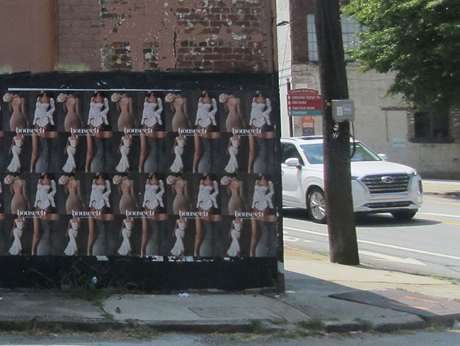
Fashion Retailer Wild / Wheat Paste Ads Postings Promote New Store.
See the ads. >> -
Government Health Dept Ads on Standees/Banners in Pharmacies.
See the ads. >> -
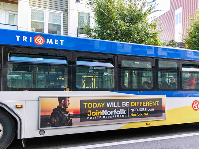
Police / Law Enforcement Transit / City Bus Ads to Recruit Employees.
See the ads. >>
Testimonials
One call to Blue Line Media provides us with any advertising option in any city across the country.
Matt Freeman
PETA
Blue Line Media has executed multiple government PSA campaigns in multiple U.S. cities, thereby giving our clients a truly national reach.
Sarah Parada
Porter Novelli
Working with Blue Line Media is a delight.

Judith DeCamp
ACS Quantum
Blue Line Media is extremely helpful in delivering advertising media in any city we want across the country.
Sheldon de Souza
Better World Advertising
Copyright 2026 Blue Line Media Inc
Blue Line Media is not the owner or exclusive provider of advertising formats presented on this website.
Not all images represent ads placed by Blue Line Media. Images may be subject to copyright. Names and trade and service marks are property of their owners and are not intended to endorse Blue Line Media.
In accordance with its Accessibility Statement, Blue Line Media is committed to ensuring accessibility of its website. To report an accessibility issue, request accessibility assistance regarding website content, or to request a specific electronic format, please contact the accessibility coordinator at 800-807-0360 or complete the form. Reasonable efforts will be made to accommodate all needs.
By using this website, you consent to the placement and storing of cookies on your computer by this website. These cookies are used to collect information about how you interact with our website and allow us to remember you. We use this information in order to improve and customize your browsing experience and for analytics and metrics about our visitors both on this website and other media. To find out more about the cookies we use, see our Privacy Policy.
The Geopath Audience Location Measurement data is provided by the GeoPath, Inc. New York, New York. © Copyright 2026 All Rights Reserved.
Certain info and images may be AI-generated. Double-check important info and images.
BACK TO TOP